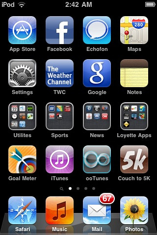
So, I installed the newly released iOS4 on my 2G iPod touch last night, and spent way too much time playing with it. Having done so, I have a couple of thoughts. First, wow, it’s fast and smooth and awesome. Second, I love the concept of folders, and I’m really glad to have my ridiculous multitude of apps organized at last — three screens instead of seven! However, although Apple has done its best, and the tiny icons inside the folders are a neat idea, the overall effect of replacing too many app icons with folder icons is, IMHO, to make your home screen(s) kind of, well, ugly.
I’ve tried my best to avoid this by limiting the number of “folders” bunched together on a single screen, and placing them in a middle row, which I think limits the ugliness effect. But still:
I mean, they’re not horrible, but they’re certainly not as pretty as your standard iPhone app icon. (I wonder if they’ll look better on a “retina display”? I’ll find out Thursday!)
By the way, note the folder called “Loyette Apps” — obviously, I temporarily renamed it for purposes of this screenshot and blog post; it won’t really be called that going forward. Anyway, it contains a bunch of simple game and drawing apps that I’ve downloaded, which Loyette loves. She’s really very good at manipulating the touchscreen. And now that Becky and I are both getting iPhones, and yet my iPod touch is probably too scratched up (and obsolete; it’s an 8GB 2G model) to have much resale value, I imagine I’ll keep it but will have little use for it… and it will essentially become a $150+ toy for Loyette. 🙂 If nothing else, it should help me keep her away from my precious iPhone 4…
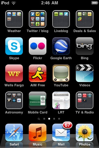
Anyway, after the jump, my second screen, whose aesthetics I’m still working on — i.e., I think it’s still somewhat ugly.
Maybe it’ll just take some getting used to. But if you were to start crowding your screens with, say, eight or more folders, I think it would start to look far less sleek and cool and Apple-y, and far more icon-y and ugly.


My main screen is folder-less, my folders live on the second screen and beyond.
I agree that its not the most elegant looking solution, but in trying to come up with alternative I can’t say I’ve had much luck. One option would be to include a set of folder icons with various identifying symbols (similar to what you see on some of the special folders in OS X and Windows like documents, system, etc.) You’d want a fairly large set though, and you could allow them to be shaded in different colors for further customization. While that would certainly LOOK better the actual useage would be cumbersome. As it is now you jsut drag and drop some icons together and BLAM folder. Nothing super complicated to worry about. Maybe they’ll add custom folder icons in a future update, but I think its one of those situations where you’ve got the best of a limited possible set of possible solutions.
I basically agree. I was just making an observation, not criticizing Apple.
A main benefit of the current set up is that it is abundantly clear if something is a folder or a app and I do think that is important. The issue might be more with trying to show 9 apps on the screen. Trying to show four, and setting up an additional resource in the app for the folder-ed icon so the developer can specifically simplify the design for the display resolution would probably help a lot. (Though I admit I’d want to keep the apps per folder to 4 if the limit it showed was four, I like being able to see at a glance what’s in there.)
My advice to brendan would be to curate the app collection a bit. I don’t think you really need four plus different twitter apps for example.
I know, I was just adding to the discussion of explaining what i thought the reasoning would be. Don’t worry, i haven’t reported you to the iPolice yet 🙂
” I don’t think you really need four plus different twitter apps for example”
I hadn’t noticed that, hilarious 🙂
I don’t see an easy aesthetic solution for this either. Perhaps they could give you the option of using one app’s icon as the folder’s icon (e.g. show the Facebook app’s icon for a “Social” folder), along with some kind of outline or shading that would indicate that it’s a folder, not the actual app. Not very elegant, but might be more visually appealing.
The one thing I do like, though, is that I can usually see what’s in the folder with a quick glance, since I visually recognize the apps I frequently use even if they’re a lot smaller now. Hopefully they’ll look sharper on the iPhone 4 display.
I don’t think you really need four plus different twitter apps for example
Heh! True. But I’ve been keeping them around while I wait for somebody to bloody implement a solution to this problem. I thought for sure that, when Twitter took over Tweetie, it would do so, but nooooo. So I’m continuing to use Echofon, which I like marginally better than Twitter/Tweetie and substantially better than the other options, as my primary Twitter client — hence its placement on the home screen, outside of the page 2 “Twitter/Blog” folder — while occasionally checking on the other apps to see if they’ve gotten freakin’ retweets working right yet.
Hmm, I don’t really look at user timelines for retweets that much, so I hadn’t noticed that issue. They show up in the primary timeline at least for twitter.
As far as the twitter API goes, it is possible, but it is not the default behavior and as far as I can tell reading the documentation, Twitter has no intention to make it the default behavior for the API.
I can even see the logic for it not being a default behavior on a twitter client app. It’s arguable what the default should be. But I tend to agree, there should be an option to show retweets. If I actually had free time I’d write it for you… Twitter apps are pretty simple, and so is the twitter API.